The destination was not the source of uncertainty. Everything that had to be arranged beforehand was.
Case 07 · Research-led concept
Guidance TravelThe journey called for surrender.Booking it called for clarity.
A directional survey with 21 respondents showed where booking confidence breaks down. Guidance Travel turns those findings into a calm route from intention to the right journey.
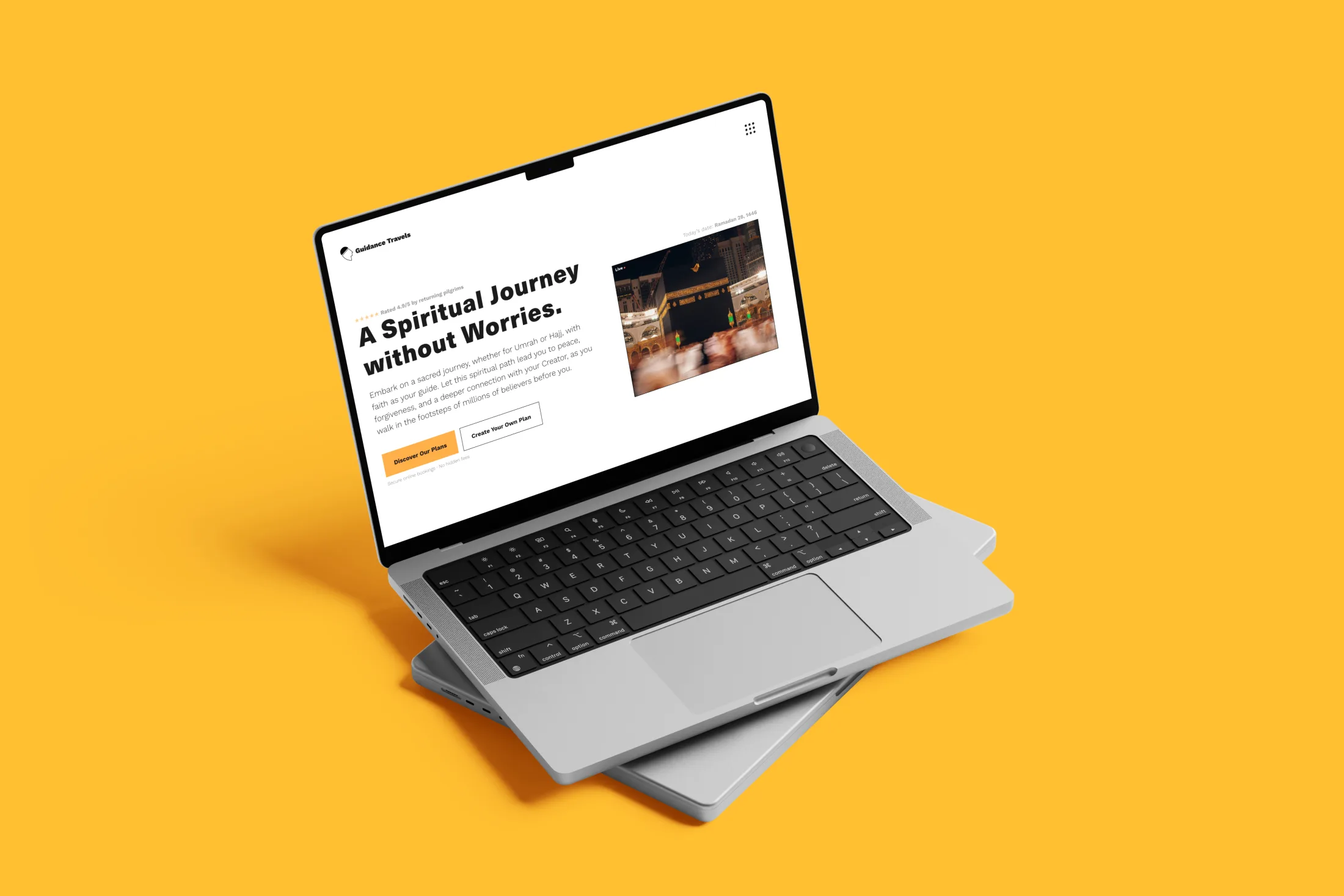
The 30-second case
Problem. Solution. Next step.
Form follows function: every element helps move one decision forward.
The interface is the hypothesis. Understanding, trust and confident choices are the measures that matter.
Research layer · directional survey
21 respondents made the missing reassurance concrete.
The survey supports the problem direction and helps set priorities. The sample is small and not representative; the proposed solution still needs usability testing.
Problem signal supported · solution not yet testedwanted a clear itinerary
n = 21wanted clear inclusions and exclusions
n = 21wanted transparent pricing
n = 21preferred WhatsApp or direct chat
n = 21The current journey loses confidence between intent and departure.
A synthesis of recurring patterns across the 21 responses; this is not a literal path completed by every participant.
- 01 · Intent
The motivation is personal
The journey starts with a strong spiritual and personal reason.
- 02 · Search
Many entry points, no fixed route
Websites and social media were each used by 11 of the 21 participants.
- 03 · Compare
Details become fragmented
Itineraries, dates, child pricing and inclusions are not always clear early enough.
- 04 · Trust
People make the promise credible
Reviews, visible guides and real service shape whether the organisation feels trustworthy.
- 05 · Contact
A conversation lowers the threshold
13 of 21 participants preferred WhatsApp or direct chat.
- 06 · Prepare
The need for information continues after booking
Practical preparation and guidance during the journey remain recurring concerns.
Research → design
Four findings changed the route.
Itinerary before package pressure
Journey rhythm and a high-level daily plan appear early.
No hidden scope
Inclusions, exceptions and costs follow one consistent comparison pattern.
People make trust concrete
Guides, their experience and role sit close to the decision point.
Contact is part of the flow
WhatsApp carries the selected journey context instead of leading to a generic inbox.
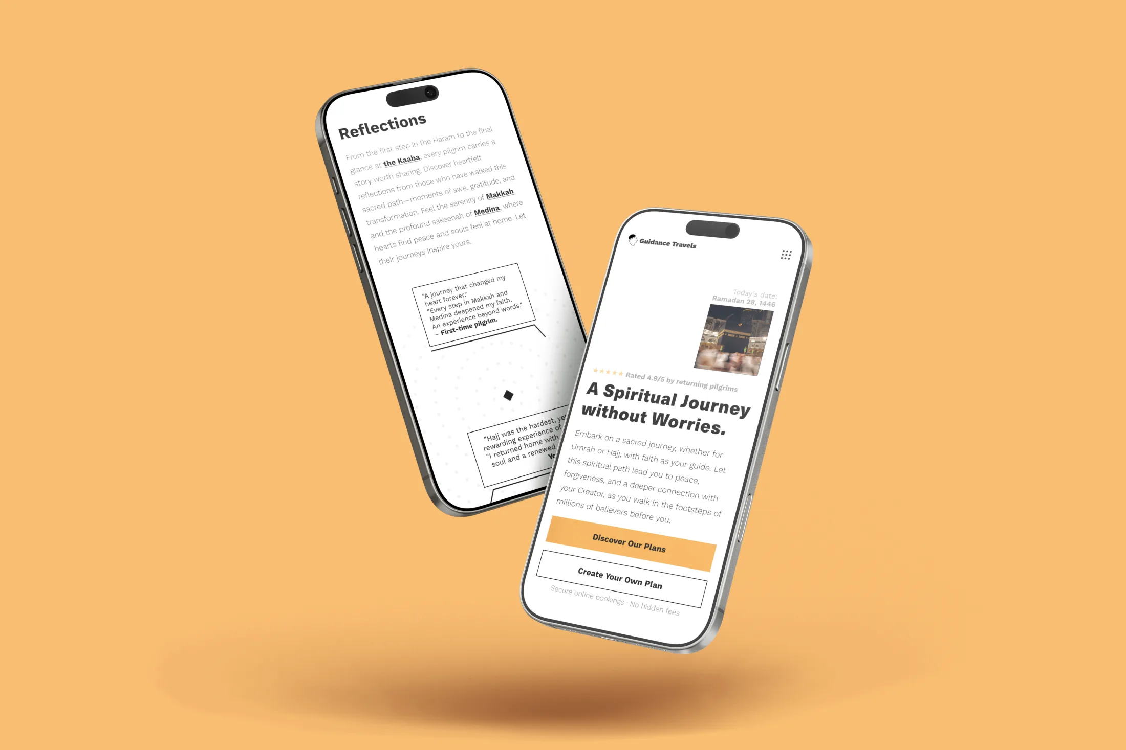
“I often could not find the itineraries for the trips.”
“It matters that you know who you are travelling with.”
Anonymous survey responses, lightly edited for spelling.
0103
The research direction
The spiritual journey felt personal. The booking experience did not.
A directional survey with 21 respondents made the priorities concrete: 17 wanted a clear itinerary, 15 clear inclusions and 13 transparent pricing. Guidance and contact need to be visible and understandable before departure.
The destination was not the source of uncertainty. Everything that had to be arranged beforehand was.
0203
The opportunity
The premium guidance was already there. The digital experience had not caught up.
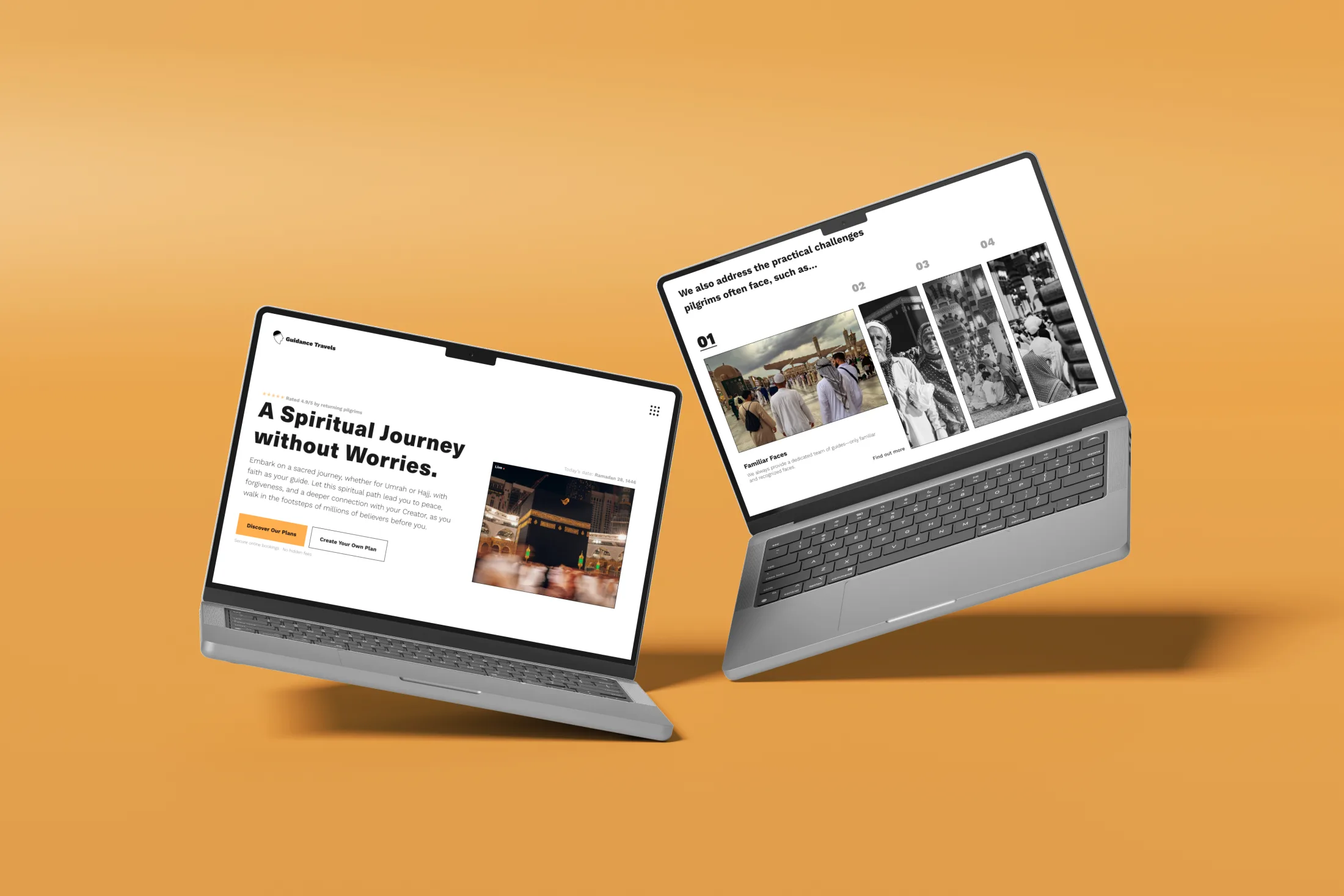
Personal guides, a clear journey and genuine care are what set the service apart. Showing that value before the price turns the website from a package list into the first proof of how thoughtfully the journey will be supported.
Do not sell harder. Show people sooner how carefully their journey will be handled.
0303
The solution direction
Start with intention and pace. Then find the package that fits.
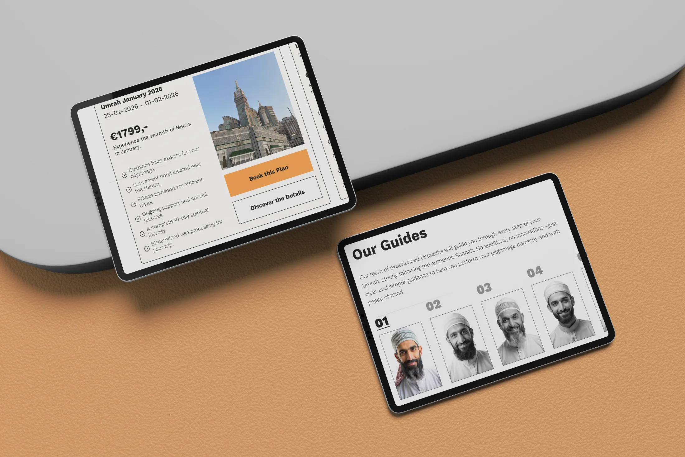
A clear flow connects the purpose of the journey with timing, group size and the level of support required. Packages are easy to compare without reducing the experience to a price filter; every option has context, clear inclusions and an obvious next step.
Form follows function: every element helps move one decision forward.
Timing & intent Travel party The right package
Optional deep diveExplore the decisions behind the solutionOpen this section for the supporting product logic, visual system and validation questions.
Trust before conversion
Every practical detail should be easy to understand.
Visitors can see who their guides are, understand what each package includes without hunting through the small print and find answers exactly when questions arise. Transparency is built into the whole experience rather than tucked away in an FAQ.
The calm interface is not just an aesthetic choice. It takes pressure out of the decision.
The design system
A restrained foundation with one confident burst of energy.
Black and off-white create a rational foundation. Cosmic Orange signals action, warmth and momentum. Direct, functional typography leaves room for imagery of travel, guidance and community to carry the emotion.
The identity draws attention at the moments when a decision needs to be made.
What still needs to be proven
The concept points to a better decision journey. Real users still need to show us which forms of reassurance matter most.
Guidance Travel is a self-initiated concept. The next step is to test which information reduces uncertainty, whether visible guides build trust and whether the decision tool helps people find the right package without making the experience feel overly commercial.
The interface is the hypothesis. Understanding, trust and confident choices are the measures that matter.
Selected screens / easy to review
One journey.
Three formats.
Four defining screens.
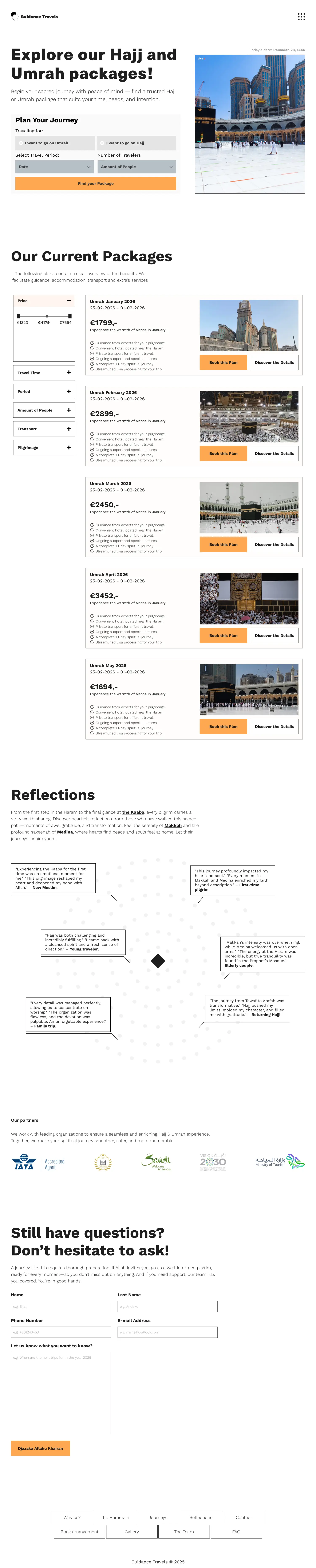
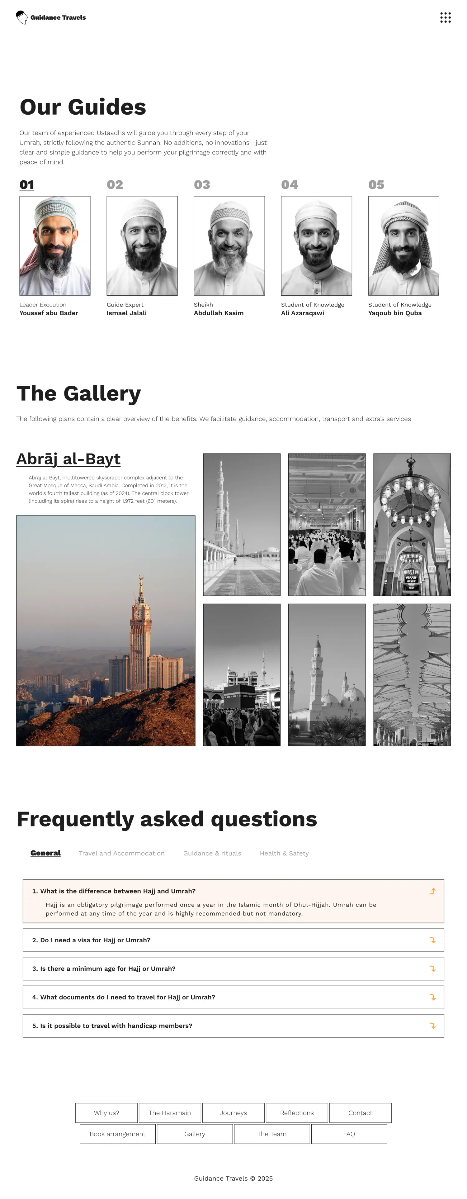
Four representative screens show the decision journey. The full responsive work remains available on request.


My contribution
From a market full of packages to a service that starts building trust before departure.
I turned the friction in the market into a clear position, information hierarchy, decision tool and responsive system. I am not claiming invented conversion gains; the concept makes explicit which assumptions still need to be tested with real travellers.